


Lightbound
WHO ARE THEY?
LightBound is a U.S. based provider of co-location, cloud, Internet, network, and voice services. They serve both global and national organizations, and are fortunate to have some of the world’s best and most successful companies as clients. Yes, large regional and national providers can offer similar products and technology, but they can’t compare with LightBound’s Midwestern hospitality and customer service.
PROJECT.
Bring Lightbound to the next level with updated design, branding and web features. They wanted to look less homegrown and more like the national company they are, so I created a sleeker look based on what branding guidelines they already had in place. The next goal was to make that look consistent throughout all their materials.
AND WHAT HAPPENED WAS…
PRINT: With a lot of complicated information and services they offer, Lightbound needed printable pieces available on their website that broke down information for clients and looked clean and professional way: ie, case studies, info sheets, manuals and infographics.
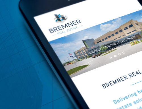
WEBSITE: with the branding refresh, the website needed some overhauling. While keeping a lot of content and navigation the same, the goal was to incorporate new branding, videos and less clutter than before.
PACKAGING: with bigger clientele, they needed pieces that caught the eye of new potential customers. Working with a content writer, we created a video card mailer with a box, trifold video-card and letterhead,
GREAT CLIENTS = GREAT WORK
Lightbound has been a great company to work with. Always flexible and open to new ideas, they have definitely taken their company to the national level. Having great clients makes me as a designer want to create the best for them and love to see the effect it makes on their growth!


